In What Ways Does Your Media Product Use, Develop Or Challenge Conventions Media Products?
Using conventions:
|
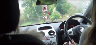
We used conventions throughout our trailer. The first convention we used was having a car scene. We chose to use a car at the start of our trailer because we felt it would add suspense as the girls are going through narrow lanes where anything could happen.
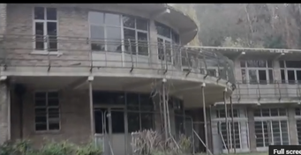
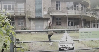
The second convention we used filming by an abandoned building attempting to get in it. We used Carol Clover's theory of 'bad things happen in bad places'. This is your conventional horror movie as bad things always happen in them or it wouldnt be scary. This is also stereotypical for horror movies as most use abandoned buildings to make it look more scary which is why we used it. The third convention we used was speeding up the pace of our editing towards the end. We did this because near the end of most trailers after you have got a good idea what is already happening so speeding up creates more suspense. |
|
|
Developing Conventions:
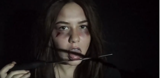
Our main prop was a knife but we changed how people normally use a knife. We had the possessed girl licking it to show knifes aren't just to hurt people. We also just played with the knifes together instead of using them as a weapon. We used different props like cards which aren't normally related to horror that much. Another way we developed convention was through high key lighting. This is developing convention as in most horrors low key lighting is used because it makes it look more scary. At the start of our trailer we used a lot of high key lighting because we wanted to show that nothing was wrong with them when they first went out and it was just them having some fun. |
|
Challenging Conventions:
We challenged conventions by only using females throughout the trailer. In most horrors
they have males who are either the bad people or save everyone at the end. We
decided to go away from this because we wanted to show that females are capable
of handling danger too.
We have also changed the way victims are shown. Normally if a group of people get
possessed a few end up being killed and there is only one that lives. We decided
to keep all the girls alive throughout.
Instead of showing them as just victims of possession we decided we wanted to make them look evil too which is challenging conventions.
POSTER
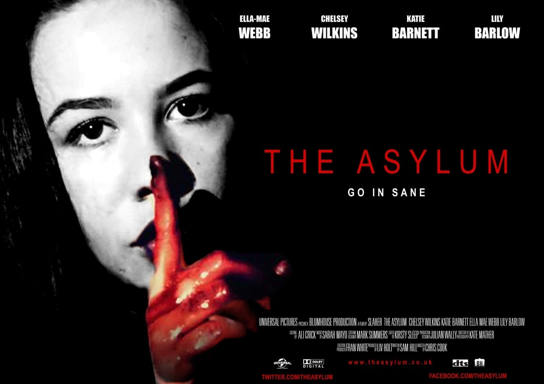
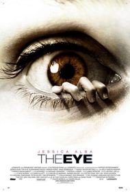
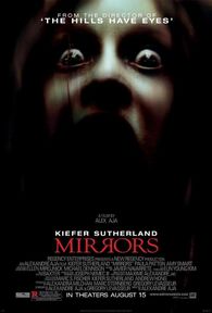
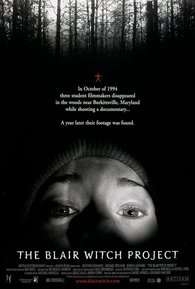
When we created our poster we decided to use a dark background with red writing to make our poster have more of a horror effect and look like something bad happens. We also went for this because we didnt want our poster to make our trailer look like it was about something innocent when its not. Many other horror posters have done similar things on their posters which are also a paranormal genre. Examples of this are the posters from 'Mirrors' and 'The Blair Witch Project'. These are similar to the poster we created because they both use a dark color scheme to show that something is wrong. Another reason we decided to use a dark scheme is because we felt like it would give a better effect on the girls getting possessed so its obvious to the audience that they aren't normal girls. An example of a poster that ours isnt like is 'The Eye' as this looks innocent due to the white background. We didnt go for something like this because it would go against the idea of the girls being possessed. The dark background of our poster goes well with the red and white text that we have used. We decided to do this as red links to the horror conventions of blood which is shown a few times in our trailer. We decided to use a bit of white to suggests that the girls weren't always evil and there was a slight bit of innocence in them before.
|
|
|
Posters for movies use the convention of putting the names of the actors at the top of the poster which we decided we would follow. This is so people know who is in the film and the first name we have put is the main actress. At the bottom of our poster we have put credits to show who was apart of what when making the trailer and what roles people played. We decided to put the title 'The Asylum' in the centre of the right hand side. We put this in the centre and made it in clear font so it is obvious that is the name of the movie and it is one of the most important parts of the poster so people know what it is called. The tag line underneath the title is in white text so it stands out next to the title. We have put it directly underneath so everyone knows it is our tagline. We have used the tag line that we have used in our trailer. Most horror posters only have a few words for their tag lines which is why we have only chosen to use 3. The other things we used on the bottom of our poster is dolby digital and dts. These are an advanced sound audio technology that allows Dolby audio experience in home theatres, smartphones, operating systems and browser. We have put these on as all posters has them and we want it to look professional.
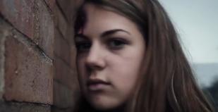
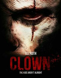
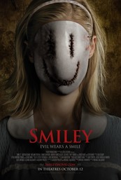
We decided that we wanted to take a still picture from our trailer as our background picture on our poster. The reason we did this is because we thought that the photo we chose is effective and shows an iconic image of what our trailer is about. Our image links to the horror convention of using a female to show weakness and something bad is happening. We decided to follow this because it shows the audience clearly that is is all about females and we wouldn't want to sent a different message across to them and them getting the wrong idea of what the movie is about. By using an image of a girl we are trying to advertise to both female and male target audiences by using something that they may both be interested in watching. Examples of these are Clown which has 'The kids aren't alright' and Smiley which has 'Evil wears a smile'.
We decided that we wanted to take a still picture from our trailer as our background picture on our poster. The reason we did this is because we thought that the photo we chose is effective and shows an iconic image of what our trailer is about. Our image links to the horror convention of using a female to show weakness and something bad is happening. We decided to follow this because it shows the audience clearly that is is all about females and we wouldn't want to sent a different message across to them and them getting the wrong idea of what the movie is about. By using an image of a girl we are trying to advertise to both female and male target audiences by using something that they may both be interested in watching. Examples of these are Clown which has 'The kids aren't alright' and Smiley which has 'Evil wears a smile'.
|
|
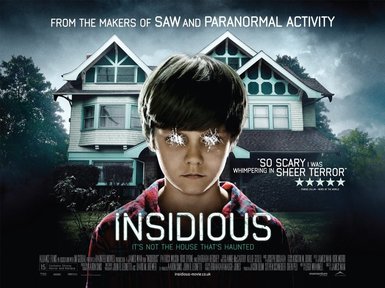
The main image on our poster is our main character shown throughout the trailer. We decided to go for this because is goes against the horror conventions of the male being a killer. We chose to use the picture we did because it looks as if she is a victim because she is a female but the blood on her hands shows that she is perhaps a killer too. We wanted to step away from this convention because and show our main character as it looks more interesting and something weird is happening. We decided to use the victim as the main picture because it make people wonder what is going on. Another movie that has used their main character as their picture for their poster is insidious. This is similar to ours as they started off innocent then something happened and they become possessed.
The fonts we have used are for our title 'The Asylum' was Lantinghei TC. The reason we used this was because we thought it looked plain and effective especially in the red colour. We decided to keep it plain because we didn't want to draw too much attention to it. This is the same for the tagline. The font we used was the exact same but we decided to change the colour to white so it was obvious it is a tagline. We took inspiration from Insidious's text as it is simple and still looks good.
The fonts we have used are for our title 'The Asylum' was Lantinghei TC. The reason we used this was because we thought it looked plain and effective especially in the red colour. We decided to keep it plain because we didn't want to draw too much attention to it. This is the same for the tagline. The font we used was the exact same but we decided to change the colour to white so it was obvious it is a tagline. We took inspiration from Insidious's text as it is simple and still looks good.
Magazine
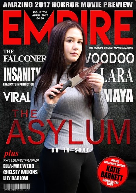
We decided to use a brunette girl on the front of our magazine to go against the conventions of horror by the victim being a blonde girl. We chose to use a dark hair girl so it wasn't exactly like all horrors. We didn't use a male as the picture because we didnt want to follow the stereotypes of the male being a strong character as we wanted to make it obvious that the female is the victim and there arent any males throughout our trailer. A lot of magazine covers have the male and female on the front and the male being in more power than the female. We didnt want to do this because we didnt want to follow Clovers theory of the girl being weak because that isn't want ours is meant to be about. We made a decision to have her facing the camera so that she was looking at the target audience and making eye contact with them. Using a girl on the front holding a knife allows people to think the opposite from the stereotypes of girls being weak and make her look strong and she can cope with the things that happen to her. We chose not to use an image from any part of our trailer because we wanted to show what she is like before all the possession happened to her and that she was a strong female. If we used an image that was shown in the trailer it would show her as being weak which is a stereotype of girls in horror. Another reason we chose to use a different image was because if we used one from the trailer it would have no other story to it so nobody would really know what was going on. By using an image we took of just the female it links that the trailer is perhaps about a young girl. We wanted our magazine to be more of the glamorous type to make people pay attention and want to buy the magazine. This is also following convention because professional magazines will take high quality photos so people are more attracted and persuaded to buy the magazine. We have followed conventions by only having one person on the front. However some have all the main characters on which we didnt want to do as we thought it would be too much. W chose to use the knife because we wanted Ella to look like she wasn't just a victim like most girls in horror are. Although she is a victim in possession she is still a villain she possession can make people hurt other people. This is challenging convention because we have gone away from the idea of the girl just being the victim.
We mainly used a dark red color for our font because it reminds people more of horror and links to the stereotype. We also wanted to link back to the same colors we used in our trailer and poster as most other professional ones tend to use this colour. We used red for the bigger bits of texts so they would stand out the most next to the next of the text which isn't as important. We put the name of the movie in red and big font as this is one of the most important parts of the magazine as people need to know what it is called. Another reason for us using red is because it represents blood and horror throughout. Even though red stands out well against the background we used white as this also stands out well and also looks good next to the red. We used a convention because most magazine covers use white font a lot of the time. For the background of our poster we used a dusky effect instead of plain black. This is challenging conventions because most magazine covers use a plain white or black background with nothing else to it. This makes our magazine different to conventional horror ones.
We put the title of the magazine at the top of the page as this follows conventional magazine covers as they all have the main title at the top. This way customers are able to see what make it is and find it easily. We decided to put the title 'Asylum' in the middle of the Ella's body because we felt this way a good place to put it as it really stood out against the color of her top. We put the titles of other films around Ella as we didnt want them to obstruct the view of her as she is one of the main focuses of the magazine. This is your conventional movie magazine as all magazines put names of other films on them. This can also be a developing convention as a lot of magazines have their text overlapping the image on the front. We thought that putting these names in white went nicely on the background and it is using conventions as a lot of magazines use this colour. We added extra features 'behind the scenes devour with Katie Barnett' and 'plus exclusive interviews' in different shapes and texts because we felt that this would bring more excitement to the magazine and make it look more professional. Even though most magazines use this convention in a way it is developing conventions as well because we had to chose what we wanted to put and where we would put it.
We decided it would be a good idea to use similar fonts as other magazine covers as we didnt want to go to far away from a conventional magazine cover and not look as good as it could do by being simple. This way we have made it look a lot more professional. For the title of the magazine we used the exact same font because we wanted to make it look like it was made by them and if we had it any bigger it may look unprofessional. We followed conventions here as we put it in the same place and used the same texts and size. The tagline was put underneath the title because we wanted to give the audience an instant thought about what the trailer could be about. We decided to do this so it was following horror magazine conventions as this is the way it looks the best.
|
|
|
|
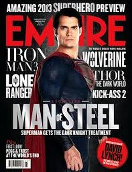
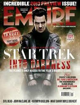
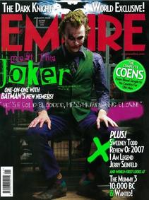
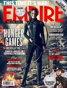
Above are some magazine covers that we took inspiration from. We wanted our cover to look mainly like the Man of Steel magazine because it has a dark background with texts that stand out well on it. Our title 'Empire' is a lot like this so we could follow conventions. All of these magazines inspired us to only have one person on the front as it draws the attention to them more.
