|
|
As a groups we have to set an iconic image for our trailer, poster and magazine cover. we needed a brand that would stand out and make people know it was our trailer. it needs to be professional, and iconic for it to work. making an iconic image for our film is a big project because this is all part of branding and by branding on a film it makes people want to buy products and its a part of advertisement with having lots of sales and high ratings.
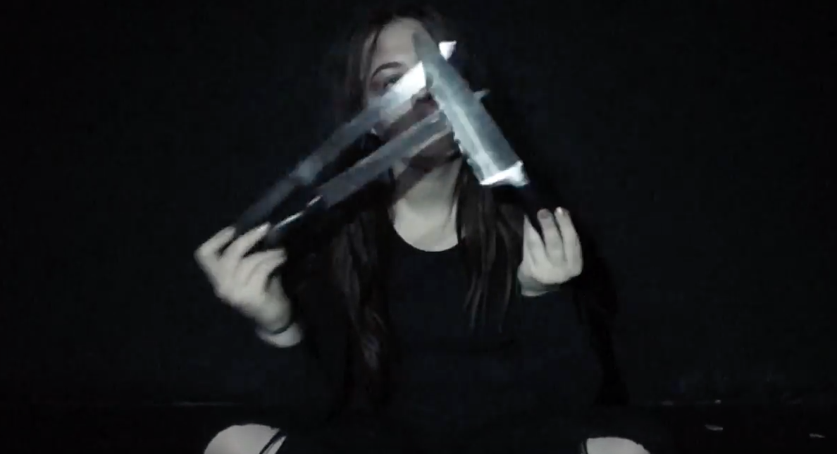
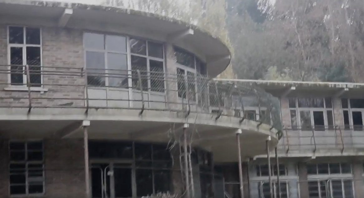
We first of all started with making the trailer and when it had been finished with we then went on to thinking of an iconic image for branding. With having the iconic eye-catching image on out magazine poster and trailer we needed to brain storm off the trailer and then as a group we came up with the idea of having the abandoned building featuring on everything because it's the first thing we see in the trailer and also the first thing we talk about. The second idea was to have the main character (Ella) on everything as she is the most seen and is the daredevil of the group in the film. Then the final idea was having the knives incorporated in there somewhere because they make a lot of appearances within the trailer. All together as a group we had to think about the characters being used, the fonts, props and locations that could be our iconic image.
We first of all started with making the trailer and when it had been finished with we then went on to thinking of an iconic image for branding. With having the iconic eye-catching image on out magazine poster and trailer we needed to brain storm off the trailer and then as a group we came up with the idea of having the abandoned building featuring on everything because it's the first thing we see in the trailer and also the first thing we talk about. The second idea was to have the main character (Ella) on everything as she is the most seen and is the daredevil of the group in the film. Then the final idea was having the knives incorporated in there somewhere because they make a lot of appearances within the trailer. All together as a group we had to think about the characters being used, the fonts, props and locations that could be our iconic image.
Films that are iconic by their branding-
|
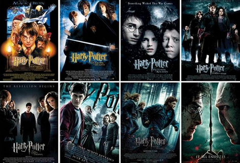
1) Harry Potter- text
The Harry Potter films are iconic for its font as it has been used the same colour and the same font all the way through the years from 2001 to 2011. For 10 years and longer whenever there is a spiky-looking font, it instantly reminds people of Harry Potter because of the branding that is used. The memorable font that is used is used on every piece of merchandise, poster, magazine, book that is to do with Harry Potter will be recognised by customers will instantly know its the famous Harry Potter and may even want to buy. This is the same with any film that is iconic for their fonts. The colour of the font is also quite bleak so therefore its a good thing because dark colours are related to the film. The last thing that is special about this font is that with the letter P in Potter there is more of a long and sharpness to it and this represents Harry's scar in the film. |
|
|
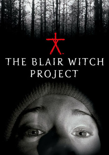
2) The Blair Witch Project- character
In the film The Blair Witch Project the iconic image for branding is the actor in the film with the camera at a low angle. when people will think of The Blair Witch Project, they think of this. This iconic image is on the front page on the DVD, posters, the trailer and in the film its self. Another reason why they would use this woman as the iconic image of the film is because she is a main character in the film and is well known. the final reason why they might have used this woman as the icon image is because then the horror film draws the male gender in if they see the main character as a woman. |
|
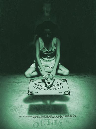
3) ouija- props
The iconic prop that is used in the film Ouija is the ouija bord. the reason for this is because the main item in the film, has a big significance on all the characters and the film is even named after it. The whole story line is to do with a girl and her bored and her wanting to play with it. |
|
films that are iconic through their posters-
After we got the idea of our own iconic image and looked at professionals doing it we then went onto looking at how our group can incorporate it on our poster and then after onto our magazine. It was important for us to do a lot of research on both how films have an iconic image through posters and how films that are iconic through their magazines. By doing this all of the pieces fit together to gain customers for the film.
|
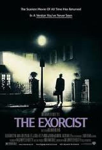
1) The Exorcist- We first of all looked posters and the first one that we thought was good for its iconic image was The Exorcist that was released in 1973. we thought that it was good because the poster cover is just of the house that the film is mainly set in throughout the film. This is the iconic location of the film and is where the girl who gets possessed is therefore will be reogniable because its the main story line without giving to much of the story away. Another reason why this poster is a good example of iconic images is it has the preist s the only person in it, and he is the main character in the film. Also with this poster is that it has a non distracting background of the colour black and this represents dullness and life-less and also it has a green-like mist coming out the window and this also represents the film by in one of the most disturbing scens of the film, she sicks out green.
|
|
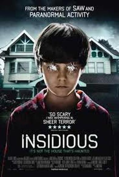
2) Insidious- Then we looked more into the iconic images on posters and we saw the Insidious poster. The iconic image of this poster is location and character. the location is important because the whole film is set in this house and this is where the demon first got into the boys body so therefore people will instantly recognise it. the second iconic image is the main character dolton and he is the main focus on this image being the biggest feature. the scratched out eyes also have a relevance to the film as this is scary like horror. The slogan on this poster is important because it says 'its not the house thats haunted', this gives people a much larger insight to what the films about and this may draw people in. With the font saying 'Insidious' its simple but effective, its also quite similar to the paranormal activity and saw fonts that are used, this is iconic because insidious is made by all three of them so there is a running thing with fonts with who makes these films. |
|
Films that are iconic through their magazines-
We also did magazine research to help us to make our magazine look perfeshinal and to be more intreeging more customers to help our brand. We had the choice to pick out of two well known magazine companies and our decision was to pick empire. We chose them because that was the more well-known one to us and we liked how much information was on the front and gives a lot of information on the newest upcoming films that are out.
|
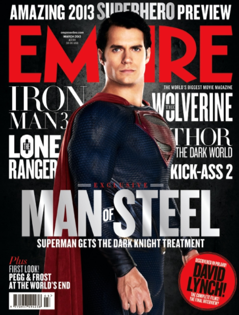
1) superman- Here is a poster of Superman. We This was the poster we got our inspiration off because we liked the way there was the main character as the main focus as we wanted to make ours the main focus and the way that there was slots of information for people to look at all around the magazine. We thought the other films on the magazine would be diffrent because on other magazines you wouldn't see other films on there because they would want other films having the limelight. As we can see the iconic image in instantly Superman with his costume on witch people would instantly recognise, especially with the logo for superman on the costume. Also the iconic text is effective because it stands out from the dark background and is also the name of the film, it stands out the most for me because it is in a steel colour witch cleaver because it may not be the same as on the poster for the film but it does stand out. The have also stuck to the colour scheme by it saying underneath 'SUPERMAN GETS THE DARK NIGHT TREATMENT' so therefore they have stuck to the dark and gloomy effect also having the iconic red for superman featuring throughout the magazine.
|
Magazine-
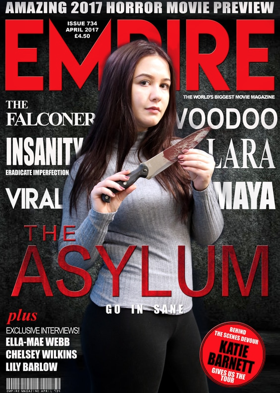
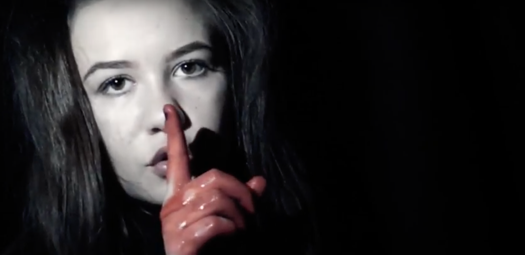
For our magazine we chose to put Ella as our main image because she is our main character that is a daredevil at the start of going into the asylum. She is the main girl in this also with her friends. We thought of putting damage and dull walls in the background to make our magazine iconic towards the asylum its self with the feel that she's in it. We also wanted the knife as a prop that she is holding to draw customers in to show that its a horror film that we are promoting and the knife is also used in diffrent parts of our trailer so there is some resemblance with everything, we wanted to put blood on it as well because we all get possessed and start cutting with self harm and various diffurent things that would represent a health disorder.
Poster-
|
|
|
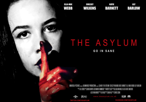
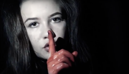
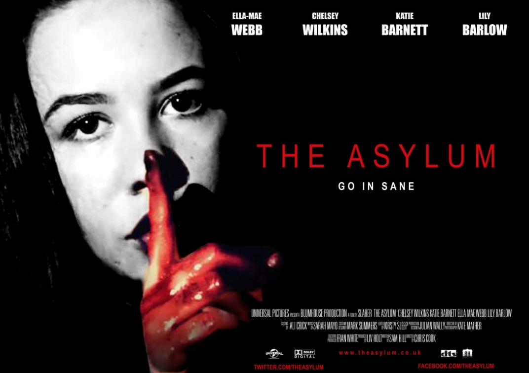
This is our original image that we chose to put as our poster, this exact pose is seen in our trailer so therefore we thought we would make it into our poster because it looks scary and at the same time is simple and we could do a lot of editing to it. We wanted Ella to be the main feature because she is the main character and we wanted the photo to be took straight on so people could see how scary the films going to be. With having the bloody hand we thought it would make people be on edge and what to know why she had a bloody hand and whats been going on? its also because the black background and red colour are iconic for our branding.
|
To make our final product towards branding we had to edit the poster. We made the background more darker by increasing the contrast, made the face more gritty with putting the image in black and white with editing it with curves,sharpness and contrast on photoshop. We then made the hand look more like blood instead of paint as it did in the orignial image so therefore we made the high and saturation of the hand more red to make it look fresh. we then went onto our trailer on final cut and downloaded the same text font so that we cold put it on our poster and made the colours the same so people could relate the three trailer, magazine and poster together. We then added all our names at the top in cold for the effect of us being the main characters in the film and to make people know it was us doing the lead roles. Finally we made the credits at the bottom of the poster so everyone can know who the whole cast is.
|
Click on the image to play-