The purpose of a magazine front cover is purposely made to influence people to buy the magazine. Institutions will need to make the front cover appealing and well presented to make the customer want to read more about it. This consists of...
- A masthead
- A tagline
- A central image
- A cover model
- An anchorage
- Secondary images
- Coverlines
- Puff (a freebie or a special feature in the magazine)
- Pug (usually a promotion from that magazine edition)
- Barcode price edition
- Use of colour
- Font
|
|
|
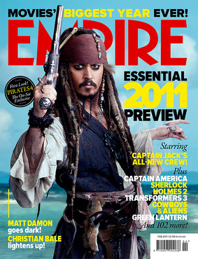
In this example of a magazine cover, we see a staged scene from a film, we are able to see all assets of the character which will help the audience get a sense of the film and recognise the genre. This appeals to the target audience of the magazine which is aimed at 16-30 year old males because it highlights the fantasy action genre of the film. The title for the institution Empire is bold and stands out so people who buy the magazine will recognise their favorite brand. The subheadings used on the front cover give an insight to what is in the magazine but it is clear that the main feature of the magazine is captain Jack Sparrow. In this example there is no secondary image seen, this may be because the main focus for this magazine is the character Captain Jack from the Pirates of the Caribbean movie so they don't want to add any other images which may distract you from that. However the magazine does features cover lines, which is to the right of the image, this is information which is inside the magazine and is there to try and lure other readers into getting the magazine. This magazine doesn't feature any element of PUFF, it also doesn't feature PUG because it doesn't have anything on the corners of the front cover. The barcode price addition does not effect the magazine.
|
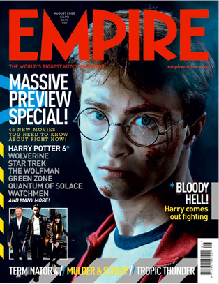
In this example we see an actual scene from the movie because he has broken glasses and shows that he is in action. The masthead is bold so people who recognise the brand or frequently buy it are able to relate to it quickly and the target audience for boys between 16-30 are attracted to the magazine. The central image is the cover model of an idol to some people and is a recognisable celebrity so fans of him and the films that he is in are instantly caught to have a look. He is dressed as though he has just been doing something in Harry Potter including some sort of action so fans instantly love it and may even recognise this scene from the film and be intrigued to know what is going on. The anchorage of the magazine is Harry comes out fighting this is helping the audience understand the significance of this picture and makes them want to read the magazine. There is secondary images which entices the reader to look at the picture instead of titles so they can visually see what is included. Cover Lines also are to the left of the central image to attempt the reader to different things included within the magazine. This magazine doesn't feature any element of PUFF, it also doesn't feature PUG because it doesn't have anything on the corners of the front cover. The barcode price addition does not effect the magazine.
|
|
|
|
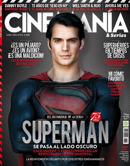
In this example there is a main character in costume who is the cover model as he is a well known celebrity. This appeals to the target audience of the magazine which is aimed at 16-30 year old males because it highlights the fantasy action genre of the film. The title for the institution Cinemania is bold and stands out so people who buy the magazine will recognise their favorite brand. The central image is the cover model of an idol to some people and is a recognisable celebrity so fans of him and the films that he is in are instantly caught to have a look. The subheadings used on the front cover give an insight to what is in the magazine but it is clear that the main feature of the magazine is superman. In this example there is no secondary image seen, this may be because the main focus for this magazine is the main character because it is a new film coming out in the cinema. Cover Lines are dotted all around the cover model. This magazine doesn't feature any element of PUFF, it also doesn't feature PUG because it doesn't have anything on the corners of the front cover. The barcode price addition does not effect the magazine.
|
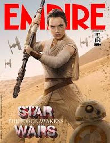
In this example we see an actual scene from the film, Star Wars. The masthead is bold so people who recognise the brand or frequently buy it are able to relate to it quickly and the target audience for boys between 16-30 are attracted to the magazine. The central image is the cover model of an idol to some people and is a recognisable celebrity so fans of her and the films that she is in are instantly caught to have a look. The title for the institution Empire is bold and stands out so people who buy the magazine will recognise their favorite brand. The subheadings used on the front cover give an insight to what is in the magazine but it is clear that the main feature of the magazine is a main character from Star Wars and it is promoting the actual film because it is an action scene from the film. The anchorage of the magazine is Rey comes out fighting this is helping the audience understand the significance of this picture and makes them want to read the magazine. In this example there is no secondary image seen, this may be because the main focus for this magazine is the character Rey. The subheadings used on the front cover give an insight to what is in the magazine but it is clear that the main feature of the magazine is superman. In this example there is no secondary image seen, this may be because the main focus for this magazine is the main character because it is a new film coming out in the cinema. This magazine doesn't feature any element of PUFF, it also doesn't feature PUG because it doesn't have anything on the corners of the front cover. The barcode price addition does not effect the magazine.
|
