We have been given the task to look at horror movie posters, we will evaluate what is good and bad about the posters and explain why.
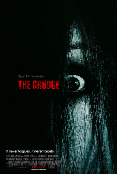
This horror movie poster is effective because there is only an eye on show for the viewers to see so it shows that in the film we as the viewers won't know who 'The Grudge' is. The front of the poster shows that the film must be quite secretive and that no one knows who this thing is, this is effective because it suits the genre and makes the viewers think what is it and that i want to watch it . The writing is in red so it must be associated with blood, this is effective because it's giving a major clue to whats going to happen in the movie and if people like blood horror films then it might intrigue them to watch it . The font of the poster looks like it is scratched and damaged so that could relate to what happens in the film, this is effective because its good the have thought of using a specific font weather than just a plain boring one. The dark colours and the contrast shows it's going to be quite a dark and gloomy film this is effective because it creates an atmosphere and shows death. It has the main character on the front this is effective because so we as the viewers know who the story is based around.
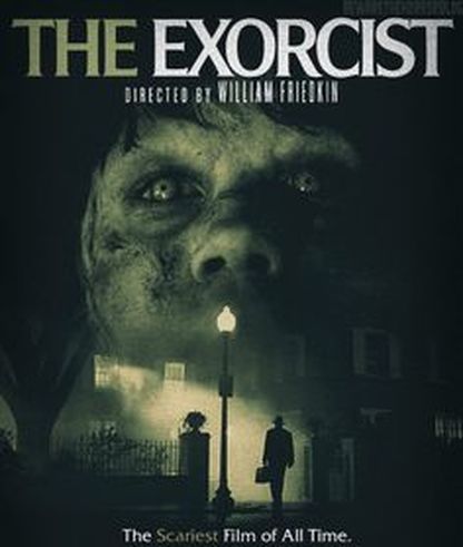
This horror money front cover is not effective because it doesn't show any other characters. This isn't effective because we only have a little intake on what actually happens in the film. The black background indicates that the film is boring as its just a black background. The text is quite small so we think the text could have been bigger to catch customers eyes and make that the first thing they look at.
This horror money front cover is not effective because it doesn't show any other characters. This isn't effective because we only have a little intake on what actually happens in the film. The black background indicates that the film is boring as its just a black background. The text is quite small so we think the text could have been bigger to catch customers eyes and make that the first thing they look at.
This horror movie poster is effective because the name of the film is big and bold at the top of the poster, this is effective because its eye catching to the viewer. The location of the film is on the poster so this is effective because it shows the viewer where the film is set and also it looks gloomy with all the smoke going through the house. This could indicate a bad dangerous fire at some point in the film. The main character is at the front with small pupils and cuts all over the face, this shows that she is being damaged and there is something wrong with her. This is effective because it makes the viewer think 'what is wrong with her?' and 'whats going to happen in the film?' This also shows that she could be quite dangerous and scary which is why the audience may want to watch the film. This will please their masochistic desires. The colours on the poster are all dark which suggests that there is something creepy going on in the house in the background.
This poster may not come across as effective because it is now quite old. This may make the audience think that the film is old too. The colours are also very dark and hard to see which wouldn't draw attention to the audience. The colour green has connotations of safety which doesn't go with the images on the poster as when the audience see them they would feel disturbed, not safe. Another way that this poster isn't very effective is that the pictures don't seem to be very detailed.
This poster may not come across as effective because it is now quite old. This may make the audience think that the film is old too. The colours are also very dark and hard to see which wouldn't draw attention to the audience. The colour green has connotations of safety which doesn't go with the images on the poster as when the audience see them they would feel disturbed, not safe. Another way that this poster isn't very effective is that the pictures don't seem to be very detailed.
- This horror movie poster is effective:
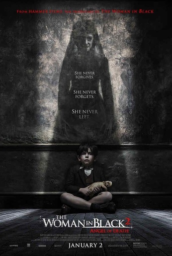
- This horror movie poster is effective because it is like all other types of horror posters, dark which gives the idea it is going to be creepy.
- The main attention of the poster is the women shadowing over the little boy. As she is hovering over him gives us the idea that she has a lot of power and that the boy is very afraid of her. The women stands out the most as she looks terrifying and very in control.
- The red used near the bottom in the title has connotations of danger which foreshadows that something bad will happen during the actual film.
- The text 'she never forgives' 'she never forgets' and 'she never left' suggests that this women in the shadows definitely is powering and that perhaps this little boy has done something to her that has upset her.
- As the title is Women in Black and the fact that everything on this poster is mainly black works really well as it goes together and makes sense. This will grab the audience's attention as they will see that it is all black and they will be intrigued as there is also a bit of red which makes it even more interesting.
This horror poster may not be effective in some ways as even though the colours match, they may come across as boring. This would make the audience think that the film may end up being less exciting than it is.
|
This horror movie poster is effective because...
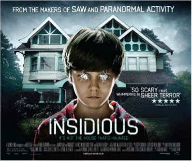
- The boys eyes are scratched out, this is effective because it makes the audience wonder and also is part of the story.
- the writing is in capital letters ' IT'S NOT THE HOUSE THATS HAUNTED' suggests that the film is to do with ghosts and spirits and also gives away the storyline to the viewers.
- The dark stormy weather, this shows that there's going to be death and that it's going to be a gloomy film. It also relates to the genre horror.
- the diamond could have been shown in it bigger on the poster to show the audience that it is to do with a demon.
- the background could have had him inside the house because that is where most of the filming is in the movie itself.
- The title 'INSIDIOUS' is in white and that goes against the stereotype of white being pure in this respect.
